

Hi. I’m Clint. I deliver scalable, enterprise solutions.
-
Executive Summary: Sometimes you just need to put a number on a thing to prove its value to an organization. In this case it was the implementation of a design system. Challenge How might we quantify the organizational value of…
-

Progress Update
Progress! Seem to have gotten the main portfolio structure figured out. Rewriting the case studies is going to take a while. I’m excited to start writing new case studies with the content I’ve gathered. I was able to write one…
-
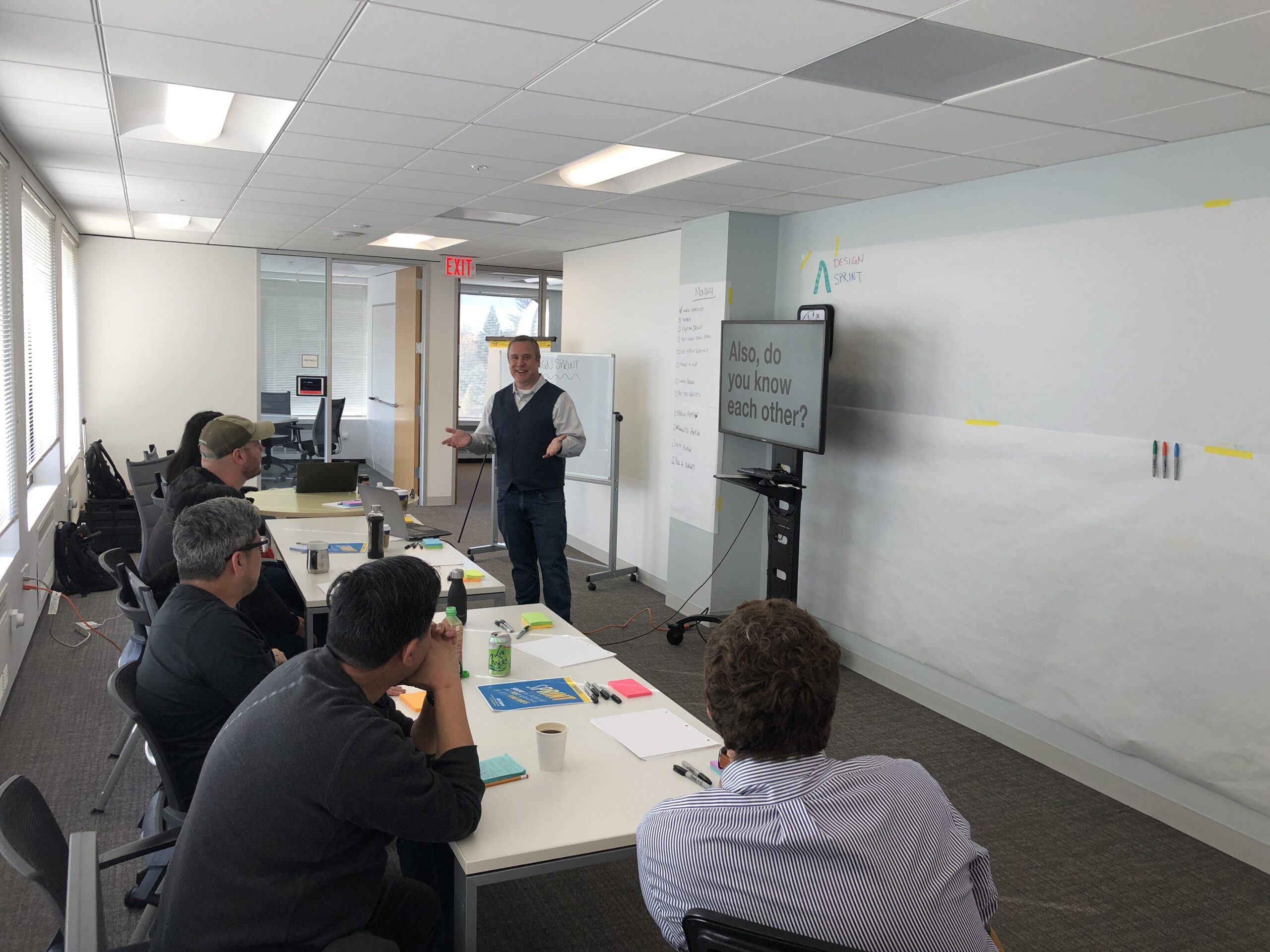
Design Sprint for Product Definition
In this case study, we will explore how I facilitated a design sprint while working as an consultant for AliveCor, a medical technology company based in San Francisco. AliveCor need a companion app to go along with it’s flagship device,…
-
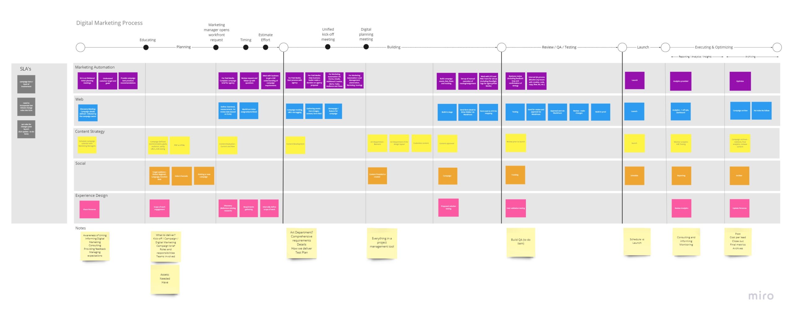
Aligning internal teams into a beneficial and cohesive process
Executive Summary: Gallagher had brought together five different teams to form a central corporate marketing team. Each team had a specific role and required similar information in regards to fulfilling marketing campaigns, including experience design. The challenge we were facing…
-
Performing discovery research to determine product strategy
Executive Summary: An insurance client, who I will keep anonymous, wanted to change their current disaster relief claims business model from part time employees to work on demand. They wanted an app that would support their claims adjustments both in…
-

Portfolio Update: Scope of Work
It’s been a while since my last portfolio update, mainly because of the confidentiality agreements. But now, those agreements have expired, so it’s time. I’ve gained a lot of knowledge since my last update, and realized that some of my…
-
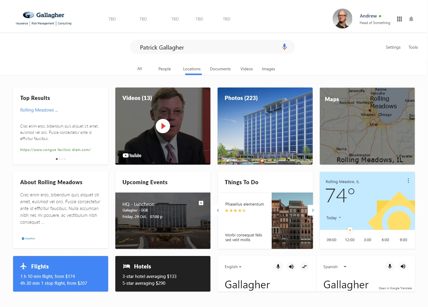
Consolidating Multiple Enterprise Intranet Experiences for increased engagement
Executive Summary: Gallagher’s intranet “Gallagher One” was actually a combination of 5 different internal portals serving their 49,000 plus employees. The intranets provided information across the entire company and managed different functions including HR, Business Development, Sales, Educations, etc.. They…
-
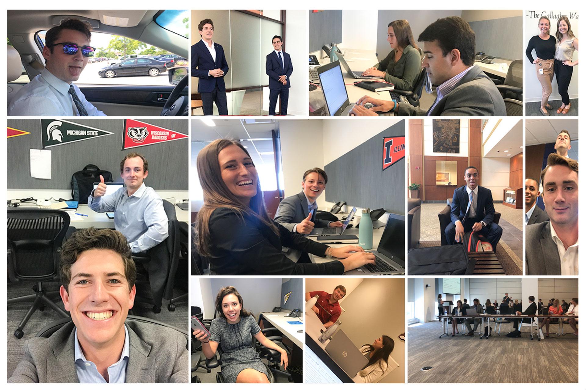
Understanding the Intern Experience
Executive Summary Each year thousands of college students applied for a much sought after internship at Gallagher. The company took great pride in its internship program and looked to continually improve the experience. A new HR team was formed to…
-

Modernizing an Enterprise B2B2C Transactional Platform
Executive Summary A formerly unstoppable insurance juggernaut of a product had lost its appeal with time. A modern approach was needed to reclaim its position at the top of the market. Challenge RLI’s industry-leading insurance provider platform had experienced a…
-
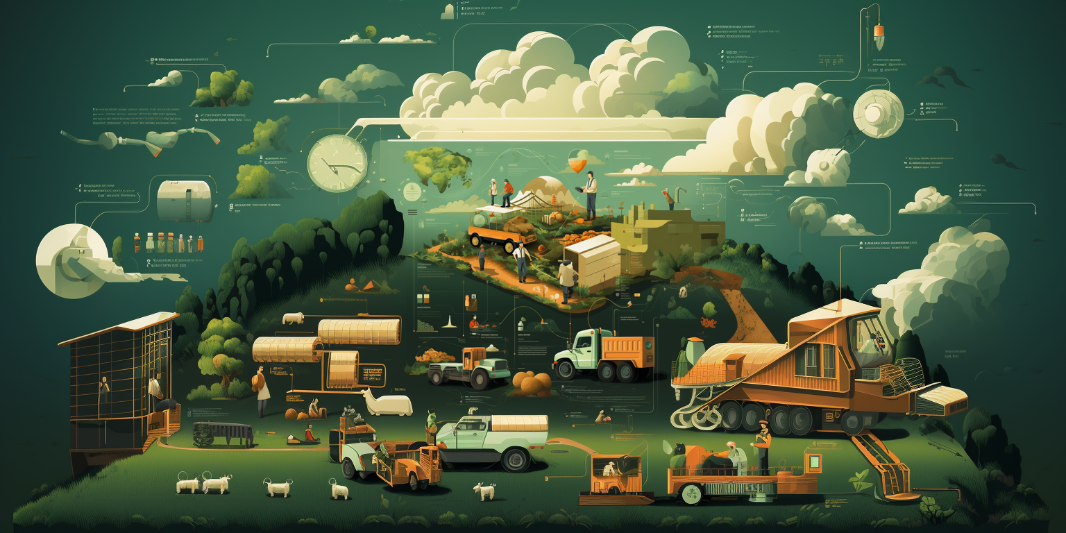
Defining Enterprise Product Delivery Process
Executive Summary: Monsanto was “old school” in it’s research and tracking of data. When someone told you all the data from their experiments was in their journals, it meant it was literally written in a journals. A massive digital transformation…