Executive Summary
A formerly unstoppable insurance juggernaut of a product had lost its appeal with time. A modern approach was needed to reclaim its position at the top of the market.
Challenge
RLI’s industry-leading insurance provider platform had experienced a market share decline of over 15% in market share for their flagship product RLink2. Although the product commanded respect, it was approaching the end of its life cycle. The challenge was amplified by limited browser support, as most features would not be compatible beyond IE7.
Results
RLink3 was launched and immediately started to regain market share, and currently maintains 97% CSAT score. The unexpected results came in the form of order processing and inter office efficiency. The improved workflows allowed for quick and accurate work of each order decreasing fulfillment time by 30%.
The Details
As the UX manager, I assumed responsibility from requirements gathering to delivery. I played the dual role of researcher and lead architect, bridging the gap between the development and product teams while educating them on experience design. In addition to project management, I was accountable for weekly reporting.
Research: This extensive product encompassed numerous variations based on user input and data selections. Understanding the workflows presented an immediate challenge. Simultaneously, focus groups were conducted with both internal product users and end users.
Focus Groups
The focus groups revealed a plethora of concerns and aspirations. These were compared against the overall project scope, identifying four out of five key drivers that could be accommodated within the allocated budget. These drivers became our guiding principles moving forward.
Contextual Inquiry
Contextual inquiry was the initial step to establish user flows. I collaborated with the underwriters on the product team to document their day-to-day tasks within the system.


User Flows
The findings from contextual inquiry were translated into electronic documentation and presented for review. Working closely with the underwriters, I ensured the accuracy of each flow. It became evident that all flows could be accommodated by a unified workflow, resulting in a 50% reduction in development screens.
Strategy
The workflows provided valuable insights. Over the course of its 10+ years, this site had undergone multiple modifications without established standards. To address this, a pattern library was created, optimizing each interaction to streamline development efforts and minimize the number of patterns users needed to learn.
Architecture
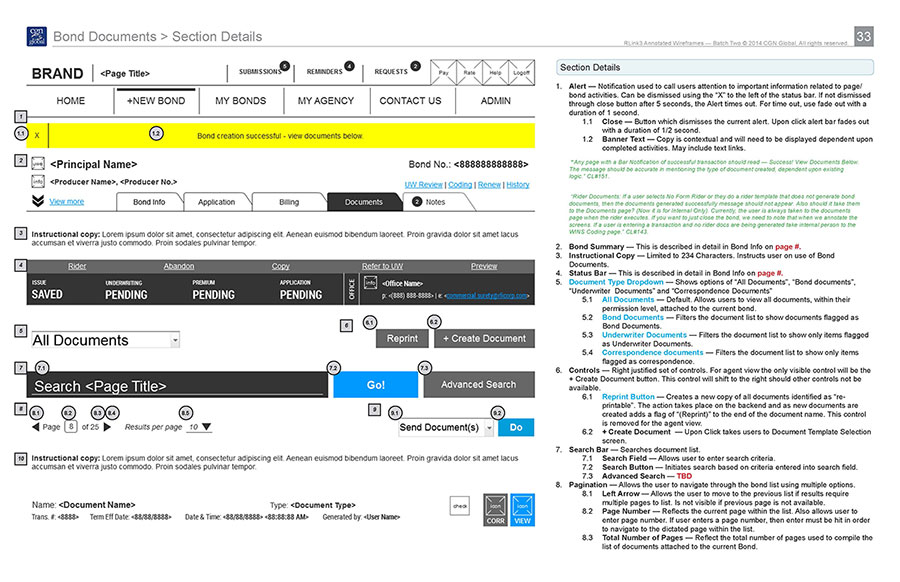
Fulfilling the product team’s request for a storyboard approach was a considerable challenge. It entailed displaying each process step-by-step, capturing all screen variations. Although it increased wire creation time, it significantly improved the overall accuracy of the project.


Developers Guidelines
Creating a streamlined pattern library yielded financial benefits. While key screens still required design approvals, we could refer to the pattern library to design the remaining common elements. This substantially reduced design costs and empowered developers to create new elements without additional design work. Each interaction was meticulously detailed down to the pixel and documented in what we referred to as “The Developers Guidelines.”
Annotations:
The entire site was annotated, and each screen was meticulously detailed to ensure development accuracy. The effort was divided into three phases to allow for feedback and minimize project delivery time. First, global elements were annotated, followed by common section elements, and finally, unique screen elements. This approach ensured that revisions only needed to be made once, further reducing project delivery time.