
The U.S. Bank Corporate Payment Solutions (CPS) asked, “How can we boost user engagement?” Despite consistently adding relevant, user-centered content, users rarely viewed more than one page.
Challenge
For nearly five years, U.S. Bank CPS underwent annual redesigns in an effort to increase consumer engagement and conversion rates. However, each redesign failed to deliver desired results, as analytics remained unchanged. The client entrusted us with the task of doubling pages per click and increasing traffic.
My Role
This project held immense importance to me personally. I had long advocated for experience design and now had the opportunity to demonstrate its value to both the client and my agency. I assumed the lead role, responsible for strategy, research, and architecture, while also training a copywriter to become a content strategist.
Research
Before identifying a solution, understanding the challenge at hand was crucial. We began our research by conducting interviews with both the client and end-users. Simultaneously, we conducted a comprehensive review of the site’s analytics and content.
The research and interviews uncovered two key issues. Firstly, the site suffered from shallow keyword density, with similar content rarely using the same terms twice. Secondly, like many corporate websites, it lacked access to relevant content, leaving users unsure about their next steps.
Strategy
With increased traffic and engagement as our primary objectives, our strategy aimed to address two measurable goals: reducing the bounce rate and increasing pages per click. To tackle these concerns, we adopted a comprehensive approach that focused on information architecture and content strategy.
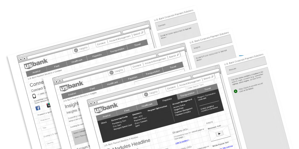
Information Architecture
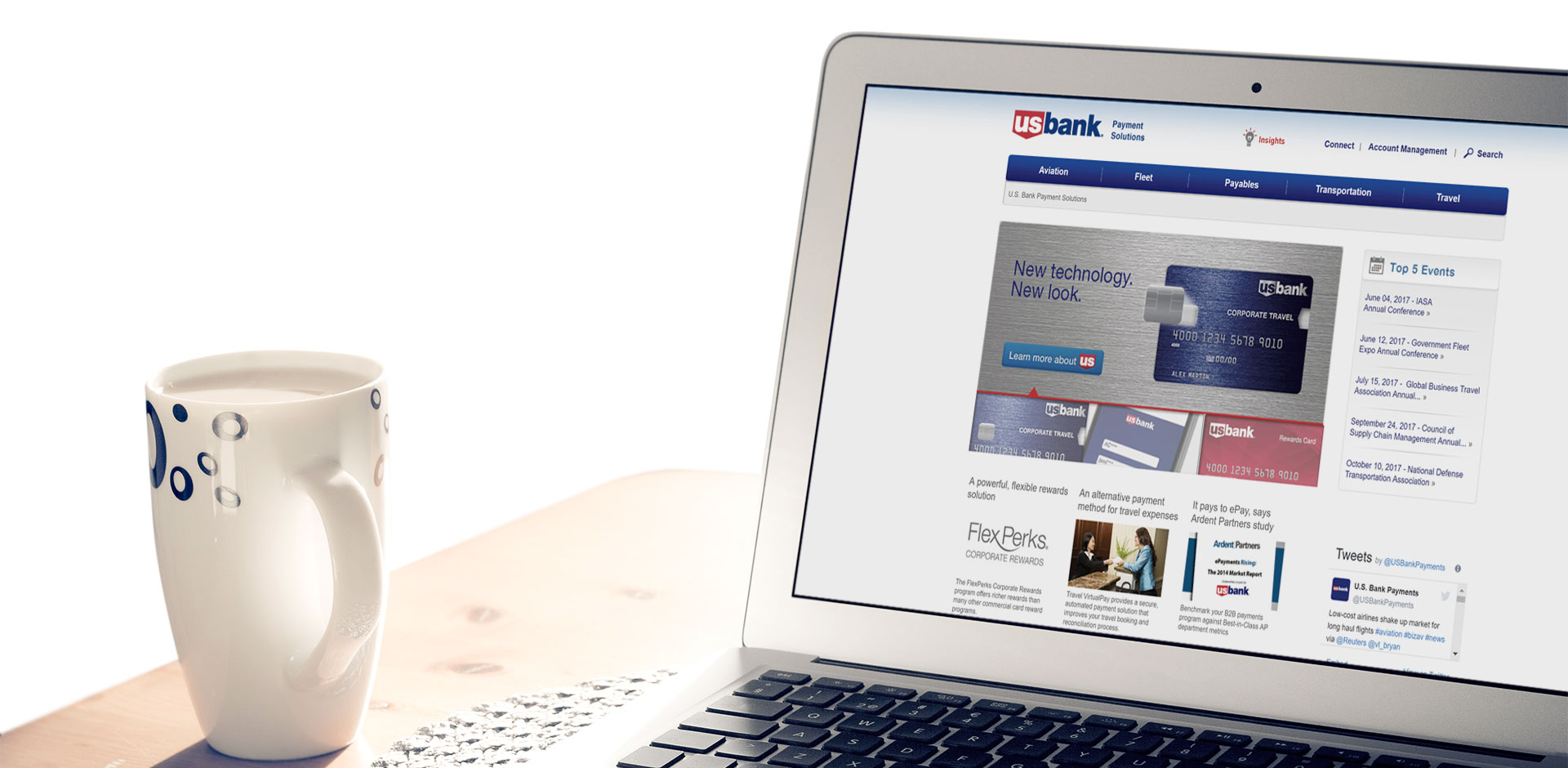
We reviewed various design patterns, emphasizing user engagement and consistent presentation of relevant content. Given the extensive content library, we implemented three columns to showcase related content by category and tag.
Content Strategy
We conducted a detailed content review and keyword analysis to create a taxonomy that allowed U.S. Bank to utilize competitive keywords. This taxonomy was then used to rewrite each article and incorporate images and subheadings to meet user expectations for content scanning.
Results
User testing yielded positive feedback across all scenarios. The highly anticipated launch date was met with excitement. In the first month, we achieved over six pages per visit and a bounce rate below 20%. Subsequently, we closely monitored analytics to demonstrate measurable results.
Over the next six months, we carefully monitored the analytics. While site visitors initially decreased, the bounce rate remained low. Pages per visit eventually stabilized at 2.4 after the post-launch excitement subsided. Notably, at the three-month mark, we observed a significant improvement in organic search, resulting in the desired increase in acquisition numbers.