
Case study
RLI / Project Phoenix: Unifying workflows in a legacy bond system
Research, a shared bond workflow, and 142 annotated pages of implementation guidance.
RLI needed to modernize RLink, an established bond system whose workflows, interface, and application logic had become difficult to separate. The platform supported roughly $95 million in annual bond sales, as I recall. Its importance to the business made the work substantial: we needed to improve how people completed their tasks while understanding the constraints of a system that had been extended for years.
Working through CGN, I led the UX research, process mapping, interface architecture, and detailed design documentation. The engagement developed a shared workflow model and an annotated blueprint that RLI used to plan and build the updated system.
| Area | Contribution and responsibility |
|---|---|
| Research and direction | I organized research and worked with users and stakeholders to understand processes, establish priorities, and develop the UX direction. |
| Architecture and design | I mapped the workflows, developed their shared structure, and created wireframes in collaboration with RLI's business and technology teams. |
| Implementation guidance | I developed the annotation approach and worked with a layout designer to document shared controls, conditional behavior, and task-specific details. |
| Development | RLI owned the implementation. Charles, a back-end developer, completed the complex search work during the engagement; the broader system was built afterward. |
Process at a glance
- Understand and prioritize: Used focus groups, observation, and process interviews to understand the work, with business and technology discussions to establish scope and workflow priorities.
- Find the shared structure: Mapped users' processes, reviewed the diagrams with them, and developed a common sequence beneath the different bond workflows.
- Design and test: Developed wireframes with developer input on feasibility, then used paper-based testing to assess navigation. We reviewed additional requests against time and budget.
- Document and hand over: Worked with a layout designer to document global, section, and task-specific behavior; incorporated team feedback and delivered approved digital files and printed copies.
Research, prioritization, and design feedback informed one another as the work developed. RLI built the broader system after my engagement.
The original application had been carried into a web environment and expanded beyond its early framework. Browser changes were making continued support difficult. In the office, some work still moved through paper printouts, physical handoffs, and information entered again in another system. The software tracked the location of signed documents, while fuller digital handling of those records was part of the modernization need.
The interface also contained controls that affected the underlying application logic. A selection could change which data pathways were active for a form. Understanding those connections was necessary before deciding how the front end should change.
We began with focus groups. The original summary records five groups held in March 2014, involving support, sales, executives, underwriters, and underwriter assistants. Recurring concerns included a more guided bond process, better search, clearer information, easier access to relevant tasks, and less movement between pages to find messages or reminders.
I tallied recurring topics to establish the main areas of concern. We then detailed the requests and considered them alongside the content audit RLI's business analyst had already prepared. Marketing and technology brought different perspectives: the importance of a requested capability and the effort needed to provide it.
The initial numerical ratings did little to distinguish priorities because so many requests received the highest score. We moved into item-by-item discussion. Each team explained its position, reviewed the material separately, and returned with the work it was willing to support. I facilitated those discussions to help the teams establish a workable scope.
An introductory day observing work in the office was followed by detailed process interviews. I diagrammed what people did and reviewed the flows with them. Much of the complexity came from accumulated workarounds, and some steps required follow-up conversations because they had become second nature to experienced users.
For the workflows, we used an explicit order of importance. Working through the leading processes revealed a common sequence beneath their different paths. By untangling those paths into a shared progression, we could reuse the layout and controls while accounting for differences through conditional content and behavior.
I published the developing Axure material online behind a password after meetings and work sessions. That gave stakeholders continuing access to the work. When we reviewed the shared workflow together, the people involved had already helped develop and check it, and agreement on the approach was straightforward.
The wireframes made the proposed interface tangible. I worked with developers on feasibility as the screens developed, including conversations with Charles about the tightly connected application logic. Bill, the technology lead, helped establish a shared understanding between the UX and technical work. Search required substantial technical effort, which Charles took on and completed.
Seeing the wireframes also prompted additional requests. We used paper-based user testing to assess whether people could find their way to the main forms and understand how to proceed. One session involved experienced adults and, later that day, children participating through Bring Your Kid to Work Day. The children provided a group unfamiliar with the existing system. Both groups could navigate the proposed approach, with the unfamiliar group picking it up quickly.
The testing helped settle questions about navigation. Other proposals still needed scope decisions. A more elaborate feature involving random sayings and articles would have required additional work with an uncertain technical approach. The team decided against that effort within the available time and budget.
Detailed implementation guidance followed. We documented global elements and universal controls first, then elements shared within sections, and finally behavior specific to individual tasks. That structure let us describe common behavior once and concentrate the remaining work on the differences.
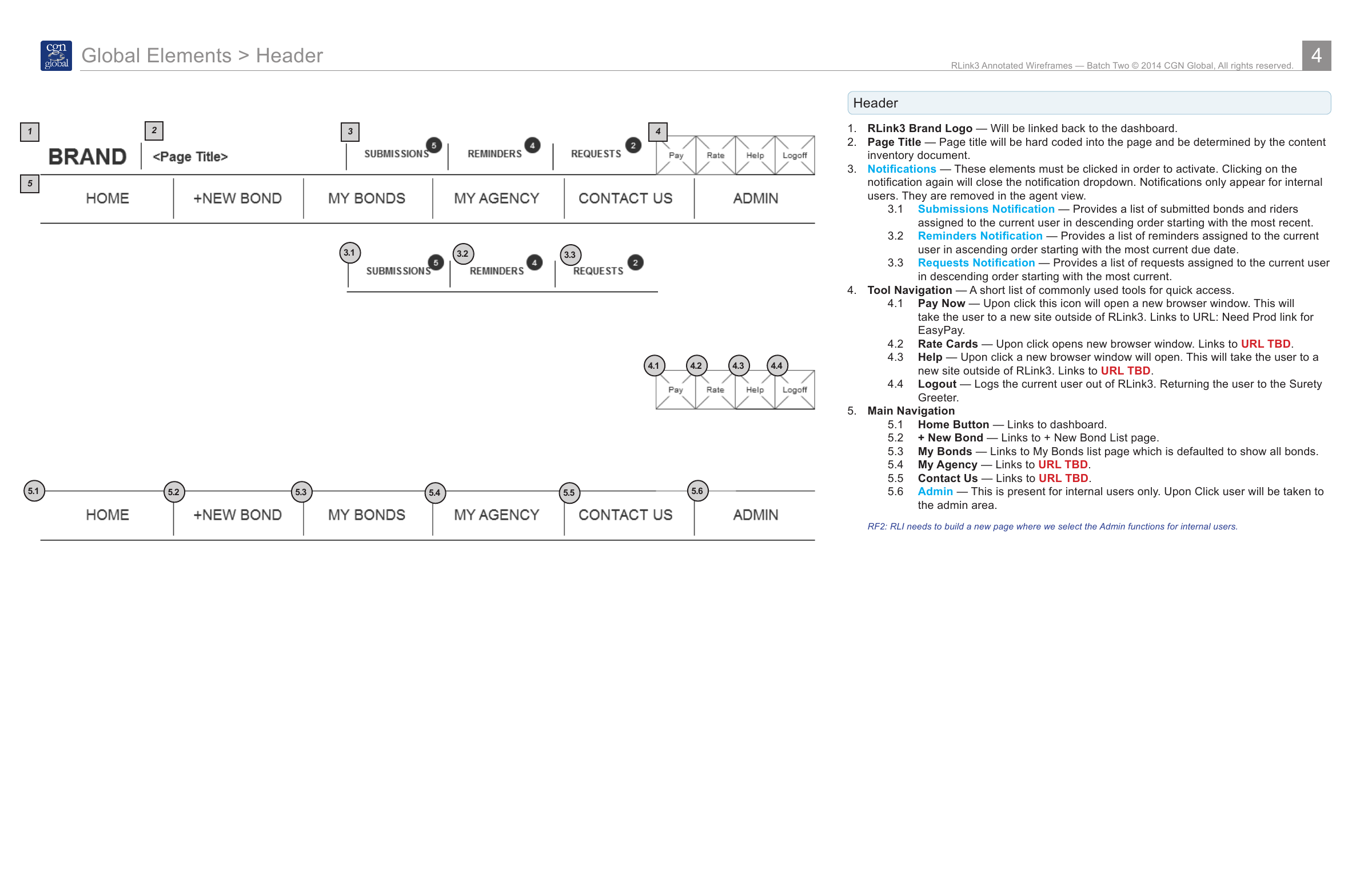
Read the annotation details
The numbered annotations connect the header drawing to its behavior. Notifications open and close on click and appear only for internal users. The notes describe submissions, reminders, requests, tool links and the main navigation; Admin is also limited to internal users. Some destination URLs remain marked TBD in the archived guidance.
The guidance covered logic and states as well as layout. When creating a new bond, the interface began with Bond Info and Notes, then revealed later tabs as the necessary earlier steps were completed. An existing bond displayed all its relevant tabs. The annotations distinguished those situations and described the conditions that changed what the person could see and do.
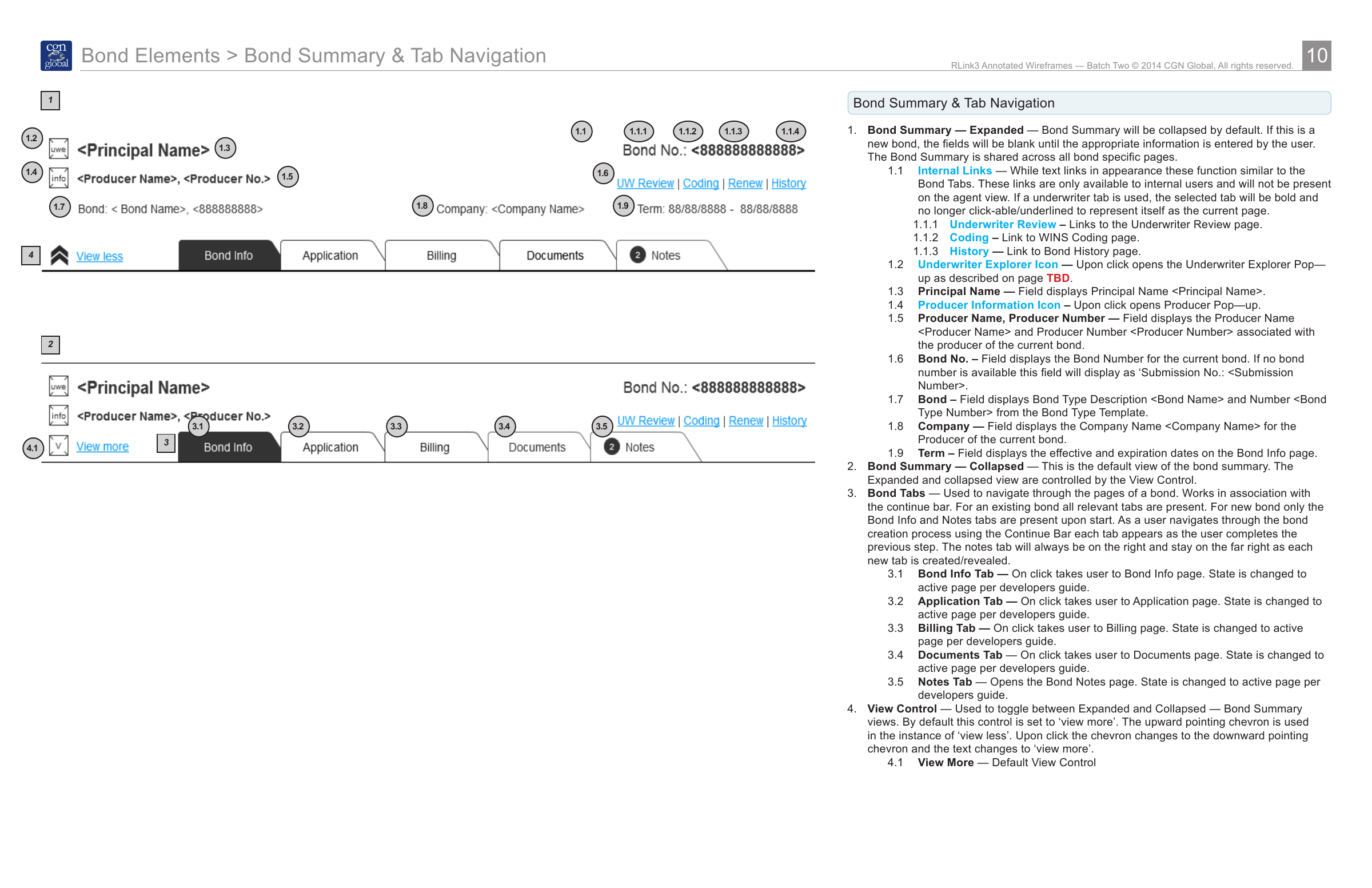
Read the annotation details
The drawing shows expanded and collapsed bond summaries. Annotation 3 explains that a new bond starts with Bond Info and Notes, with additional tabs appearing as earlier steps are completed; existing bonds show all relevant tabs. Notes stays at the far right. The view control switches between expanded and collapsed summary information. The initial two-tab state is explained in the annotations rather than shown as a separate screen.
The documented work also extended into accounts, document handling, correspondence, and the assignment of requests and transactions. Across those areas, the guidance described shared controls alongside differences in user permissions, available data, and task state. For example, email and fax used two views of the same correspondence dialog, with the selected delivery method determining which fields appeared.
A designer with strong InDesign and layout skills joined me for this work. We divided the sections and developed them within the same structure. RLI's teams reviewed the documentation and returned feedback, with Roger helping coordinate the exchange. The resulting material included the shared component guidance and three batches of annotated wireframes.
We delivered digital files and large-format printed copies after the documentation was approved. During a later visit for a separate engagement, I saw that RLI had placed the printed pages across the walls of a presentation space. The team was walking through them together to plan implementation.
The full system was built after my engagement. I stayed in contact with RLI, and Bill later invited me to see the working application following a development period I remember as roughly two years. Its screens and behavior closely followed the wireframes we had agreed and documented.
Sandy, the marketing lead, also showed me feedback the team had added to the system: a simple yes-or-no question asking whether people liked it. I recall roughly 95–97 percent positive responses, which she said had remained consistently high. That figure is my recollection of the feedback she showed me; the original response data isn't part of my retained project materials.
RLI continued developing its internal UX capability after the engagement. For me, seeing the working system and that continued investment gave the project significance beyond the original handoff. My contribution was to help the team understand its processes, find a shared model, test the proposed navigation, and document the design clearly enough for RLI to carry it into implementation.