
Executive Summary
BJ’s Restaurant wanted to bring online ordering to their customer base. Working as a consultant this was going to be a new experience for myself and the client. Deriving insights from user flows and journey maps, we meticulously crafted what we coined as the “optimal experience.” By amalgamating the finest elements and resolving challenges, our aim was to establish an exceptional user journey. As Bing Crosby famously sang, “accentuate the positive, eliminate the negative.”
Competitive Analysis
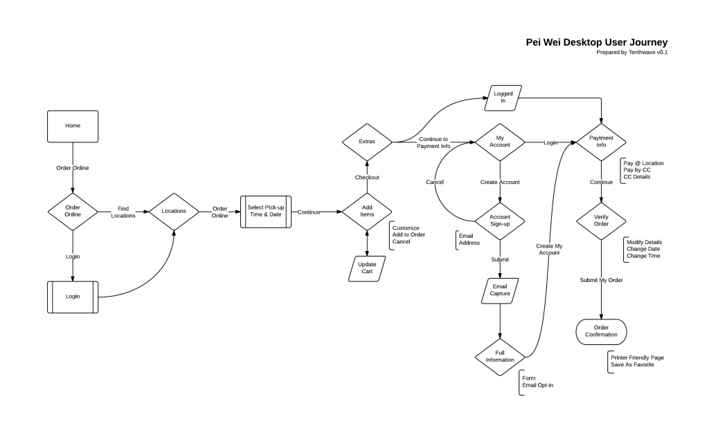
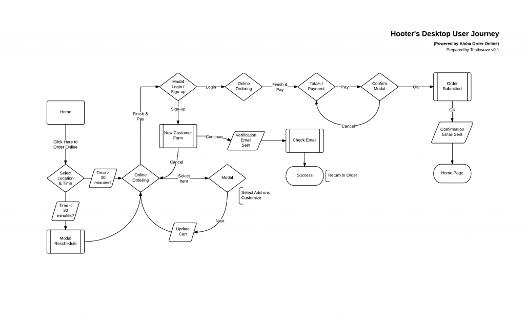
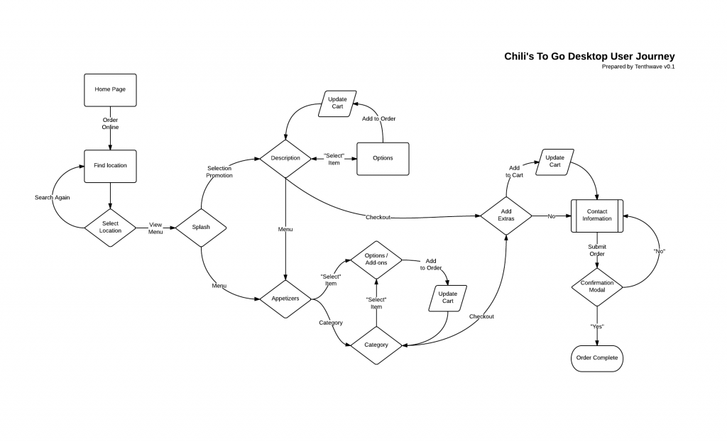
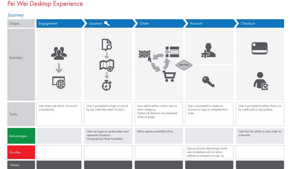
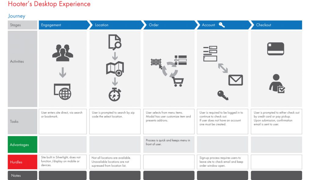
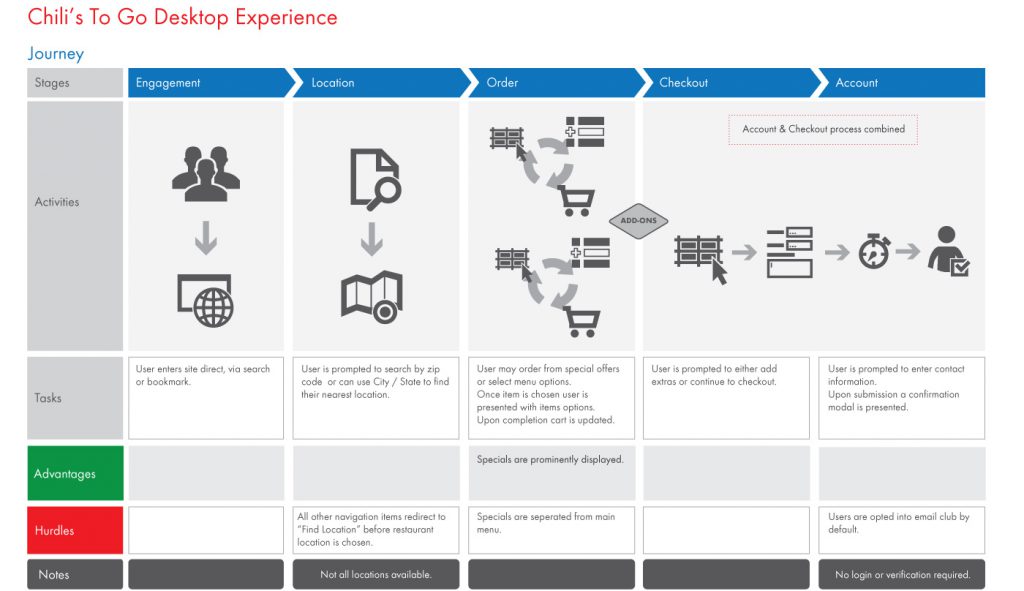
To get started we had to look at what the competitors were doing and how they’re online ordering site worked. So I started with the three main competitors and documented their user flows.
User Journeys
To create visuals to work through with the client we turned the workflows and experiences into User Journey’s. It was my first time creating user Journey’s so I was really excited. It was cool to see the experience visualized in a way the expressed the actions of the users in such a simplified way. It made a huge difference in the way the client saw the online ordering process and facilitated a common understanding.
Contextual Inquiry
Even after conducting a thorough examination of user flows and journeys, I found myself grappling with lingering questions and limited research time. Seeking inspiration, I meticulously scrutinized the menu, cover to cover. To my astonishment, I discovered several information gaps.
I realized that the menus relied on servers to fill in the missing details. Prompted by this realization, I expeditiously reached out to the nearest location, requesting to speak with a server. After introducing myself and explaining my project, the server graciously responded to my inquiries. Finally, post-interview, I felt as though I had all the pieces of the puzzle in place.
Architecture:
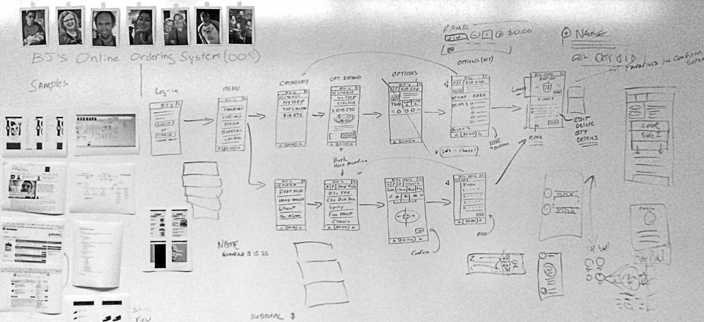
Embarking on our mobile-first design approach, we devised makeshift personas and affixed them to the whiteboard. These images, sourced from the internet, were aligned with our marketing demographics. Mapping out the user experience on the whiteboard allowed us to consider how each persona would interact with different elements.
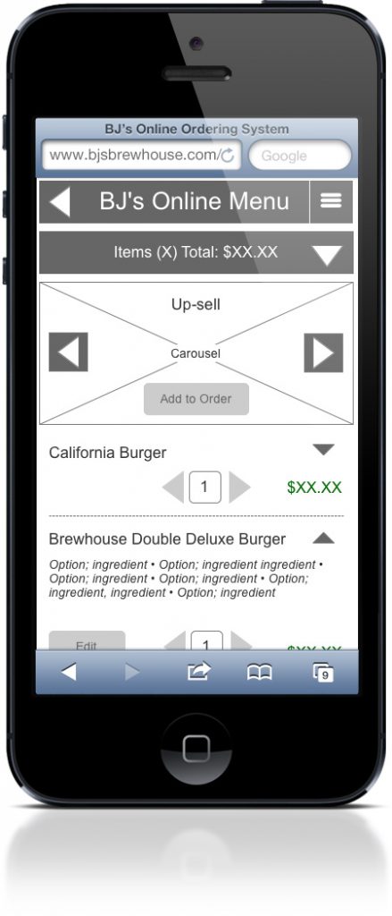
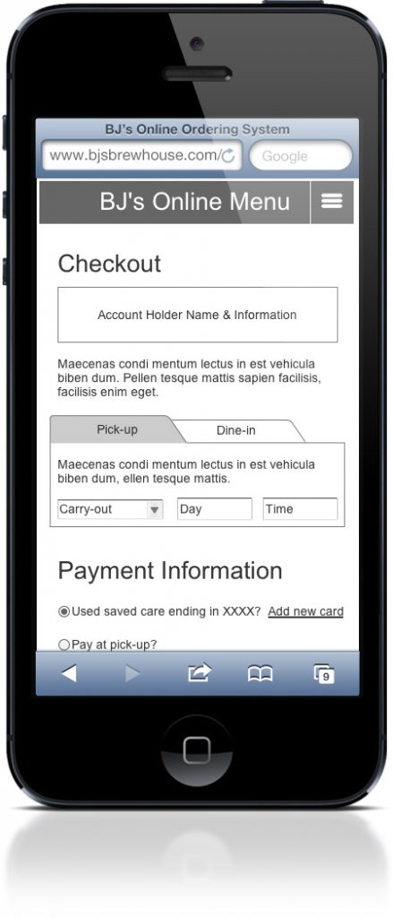
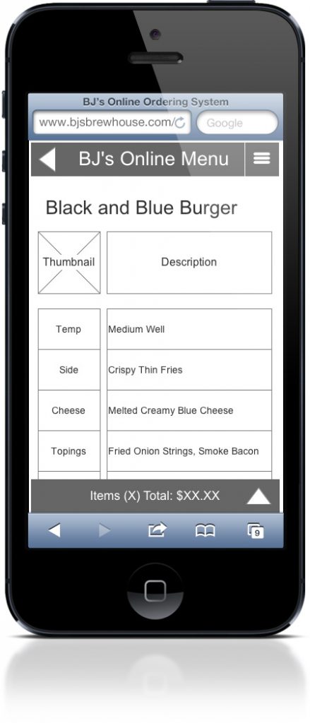
Wireframes:
After several rounds of whiteboarding, we felt prepared to transition to Axure. Maintaining our mobile-first approach, I took an additional step and created a fully functional prototype. By incorporating variables, the prototype emulated both guest and logged-in experiences.
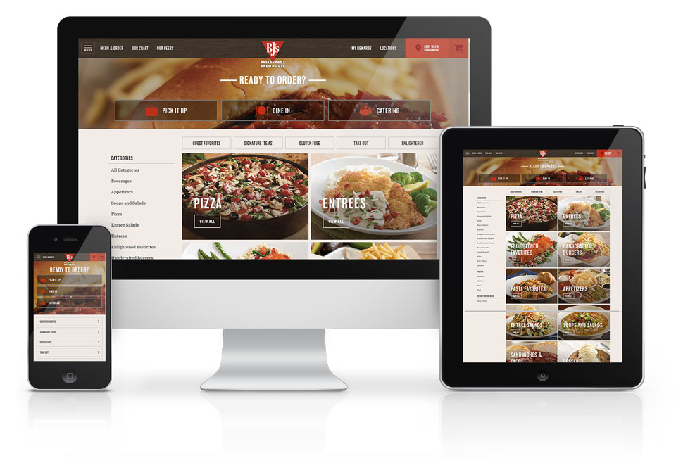
Results:
Our efforts yielded an intuitive, fully responsive web application, featuring a revamped menu flow that streamlined the ordering process and enhanced the checkout experience. Initially introduced in 12 pilot restaurants, we rigorously tested, learned, and refined the application before expanding it to all locations.
The solution made an immediate impact, resulting in significant increases in conversions and loyalty program sign-ups. We are delighted to announce that the program is now available across all locations and continues to flourish.