
The rules behind the wireframes
Shared controls, conditional behavior, and task-specific exceptions gave RLI’s wireframes a structure another team could build from.
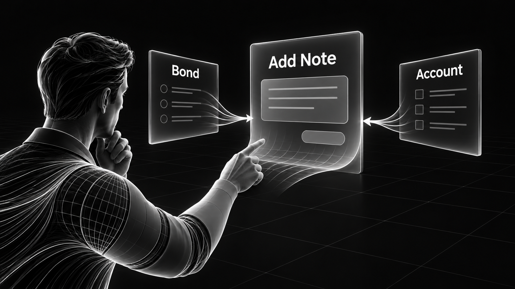
A screen can show where a control belongs without explaining when it appears, what it changes, or what has to happen before someone can use it. On a complicated application, those details are a substantial part of the design.
I encountered that challenge while working through CGN on RLI's RLink bond system. The application had grown over years of changes, and its front end was closely tied to the application logic. Some controls affected which pathways were available for data. Changing their appearance required understanding what they were doing underneath.
The users had also developed workarounds that kept the system useful. During interviews, I documented their processes and reviewed the diagrams with them. We ranked the workflows by importance and worked through the leading ones first. As we untangled those processes, a common sequence emerged.
That shared sequence gave us a basis for reusing the layout and controls. Differences between tasks could be handled through the information and actions available at a particular point. We still needed to account for those differences, but we could describe them within a common structure.
The documentation had to follow that structure too. Otherwise, we would have been describing the same controls repeatedly across screens, with the task-specific details mixed into each explanation.
We began with the global elements and universal controls. These were the parts whose behavior applied throughout the interface. Once we had documented them, we could use that common definition wherever the same behavior appeared.
The next group covered elements shared within particular sections. After that came the behavior specific to individual tasks. We worked through one workflow at a time, starting with the one the team had already ranked as most important.
This gave the documentation a practical order: establish what applies broadly, then explain where a particular process differs. The global work still took considerable effort. Reuse didn't eliminate the need to describe the logic accurately; it gave us a place to describe it once.
The Add Note dialog was one example. People could open it while working with either a bond or an account. The annotations explicitly called for using the same dialog in both places, rather than maintaining two versions. Its shared behavior included setting a reminder, choosing a recipient, and saving or backing out of the note.
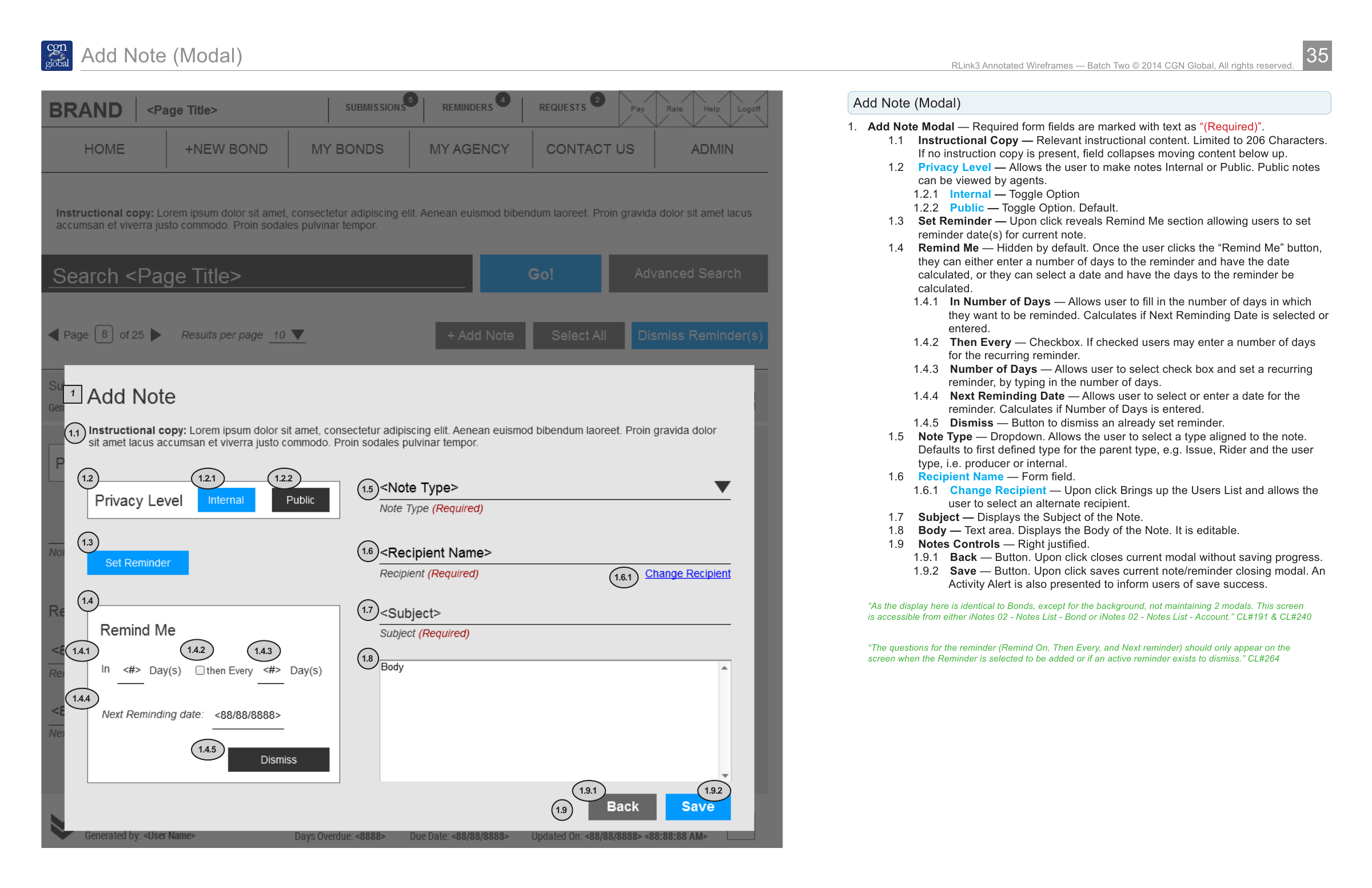
Read the annotation details
The annotations specify one shared Add Note dialog for bonds and accounts. A note can be internal or public, and reminder fields appear when a reminder is selected or an existing reminder can be dismissed. The dialog includes note type, recipient, subject and body. Back closes the dialog without saving; Save records the note or reminder, closes the dialog and presents a success alert. Original review comments remain visible.
The tabs for creating a new bond provide another example. The process began with Bond Info and Notes. Later tabs appeared as the person completed the necessary earlier steps. When someone opened an existing bond, all the relevant tabs were already available. The same navigation structure accommodated both situations.
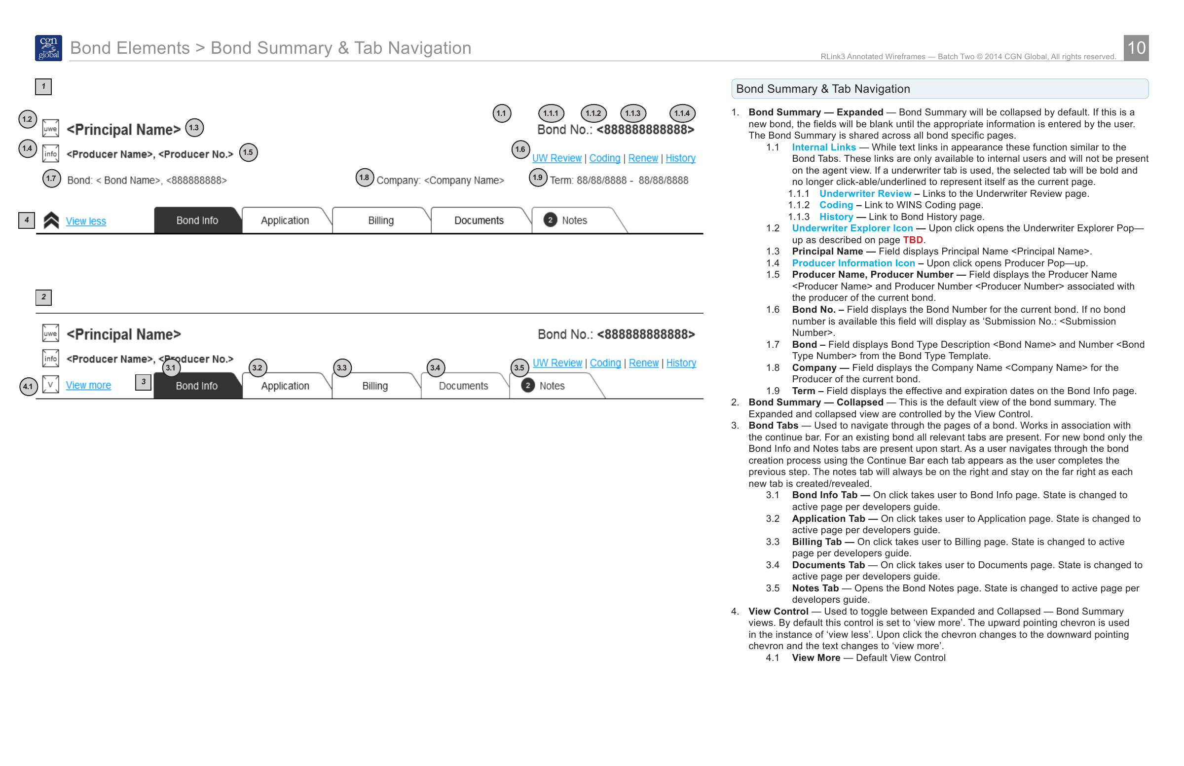
Read the annotation details
The drawing shows expanded and collapsed bond summaries. Annotation 3 explains that a new bond starts with Bond Info and Notes, with additional tabs appearing as earlier steps are completed; existing bonds show all relevant tabs. Notes stays at the far right. The view control switches between expanded and collapsed summary information. The initial two-tab state is explained in the annotations rather than shown as a separate screen.
A drawing of the finished interface could show all those tabs together. It would leave out an important part of the intended experience: the conditions under which the person reached that view. The annotations needed to connect the state of the process to what the interface displayed and allowed next.
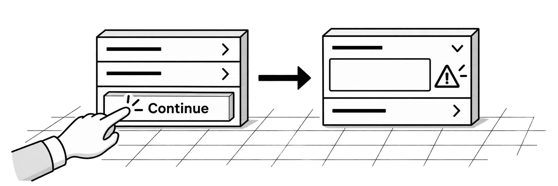
The applicant sections show why the exceptions mattered too. People could collapse an applicant's information while working through the form. If they pressed Continue and that section contained invalid information, it would automatically expand so they could address it. Correctly completed sections could stay collapsed.
Drawing an expanded section and a collapsed section would show the two appearances. The annotation explained what caused the interface to move between them. That distinction mattered just as much as the placement of the control. A developer needed to know what the person could see, what would change that view, and which conditions required a different response.
I worked through feasibility with the developers while creating the wireframes. Charles, a back-end developer, helped me understand the connection between the interface and the application logic. I would take work over to his desk, and we would discuss what was possible and what I still needed to understand.
Those conversations mattered to the documentation. I could describe the intended experience more accurately as I learned how the system operated. The developers could also see the behavior taking shape and identify concerns before it became a finished handoff.
During the annotation work, the teams reviewed the files and returned feedback. Roger helped coordinate that exchange. We used InDesign for the detailed documents and kept the files available online as the work progressed.
I also brought in a designer with strong layout and InDesign skills. Her ability to recognize patterns was particularly useful. We divided the sections, with me taking the larger ones while she began with simpler material and learned the system. The common structure gave us a way to work on different sections of the same documentation.
When the work was approved, we delivered the digital files and printed copies at eleven by seventeen inches. On a later visit, I found the RLink team had taped the printed pages across the walls of a large presentation space. They were walking through the work together and using it to plan the build.
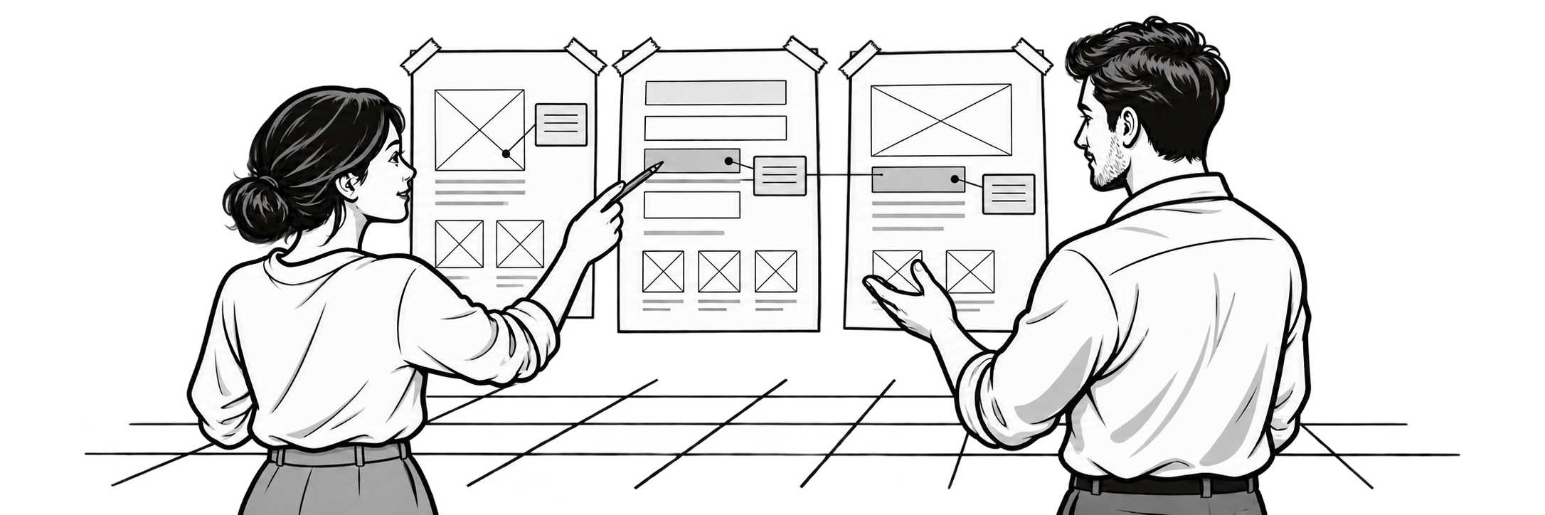
That was a useful view of what the documentation needed to support. People had to understand an individual screen, follow the process around it, and discuss how the pieces would work together. The annotations connected those levels of detail.
For a complex interface, I want the documentation to make shared behavior easy to find and exceptions easy to recognize. A reviewer should be able to follow what happens next and what causes it. That is the work behind making a set of wireframes clear enough for another team to build.
