
What the annual redesign wasn't fixing
The work behind a redesign includes research, clearer content, and a structure that helps people find what they need.

A redesign can be easier to approve and still leave the original problem unresolved. When the goal is better engagement, the work needs to account for what people can find, understand, and do once they arrive.
I learned this while working at an advertising agency on U.S. Bank's Corporate Payment Solutions site. We had been refreshing the creative each year. When the previous refresh failed to increase engagement, the client wanted to understand why. That question led to my first UX research project and the agency's first UX engagement.
I had already started questioning whether the work we were providing justified what clients were paying. Creative work had value, but I wanted a clearer connection between the effort going into a site and what the client received from it. U.S. Bank gave us a chance to examine that connection.
Researching the content and structure
The research included client and end-user interviews, an analytics review, and a review of the existing content. I led the strategy, research, and information architecture—the organization of the site's information. I also brought a copywriter into the project because content was their area of expertise. I was a designer and didn't yet fully understand content strategy. Working together let us address questions I couldn't answer through visual design alone.
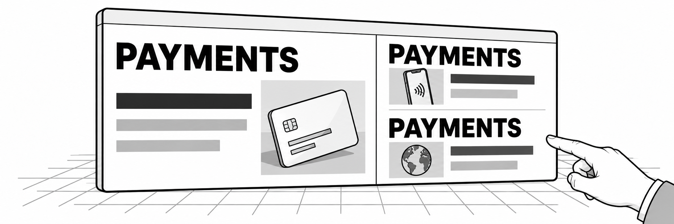
We found problems in how the material was described and connected. Similar content used inconsistent terms, and visitors had limited access to other relevant material after reading an article. The site contained useful information, but its organization made it difficult to continue exploring a subject.
Those findings gave the redesign specific work to do. Keyword analysis helped establish a consistent set of terms and categories. Articles were rewritten around that structure, with images and subheads to support scanning. Categories and tags connected related material within the layout.
The copy and the structure needed to work together. Consistent terms helped organize the content, while the layout gave people a way to find more of it. Changing the presentation without addressing those relationships would have left an important part of the engagement problem in place.
Working through the layout before visual design
We also worked through wireframes before starting the visual design. These layouts let us establish where information belonged and how the structure would support the goals. By the time I began designing, we had already answered many of the questions that could otherwise surface during a design review.
That changed my experience of the visual work. I was used to reviews that produced many different opinions, with the design becoming the place where those opinions had to be resolved. On this project, the research, content work, and wireframes gave me a clearer direction. The design came together more easily, and I remember very few revisions.
I initially found the reduced feedback surprising. Looking back, much of the decision-making had already happened. We had established what the site needed to support and worked out a structure before asking people to assess its visual treatment.
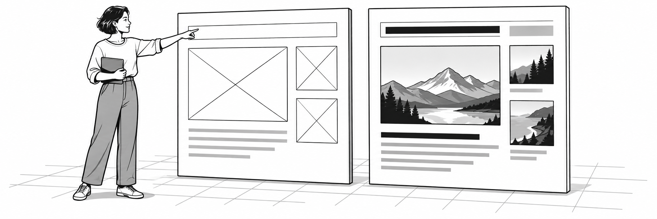
That is a useful distinction when planning a redesign. A visual review can consider hierarchy, readability, consistency, and how well the design expresses the intended structure. It becomes harder to use that review well when the purpose of the page, the content it needs, and the actions it should support are still unsettled.
Earlier decisions can also be revisited. Research and wireframes don't guarantee that every choice will work. They make the reasoning available so the team can identify what needs to change, rather than treating every concern as a request for a different visual treatment.
Returning to the results after launch
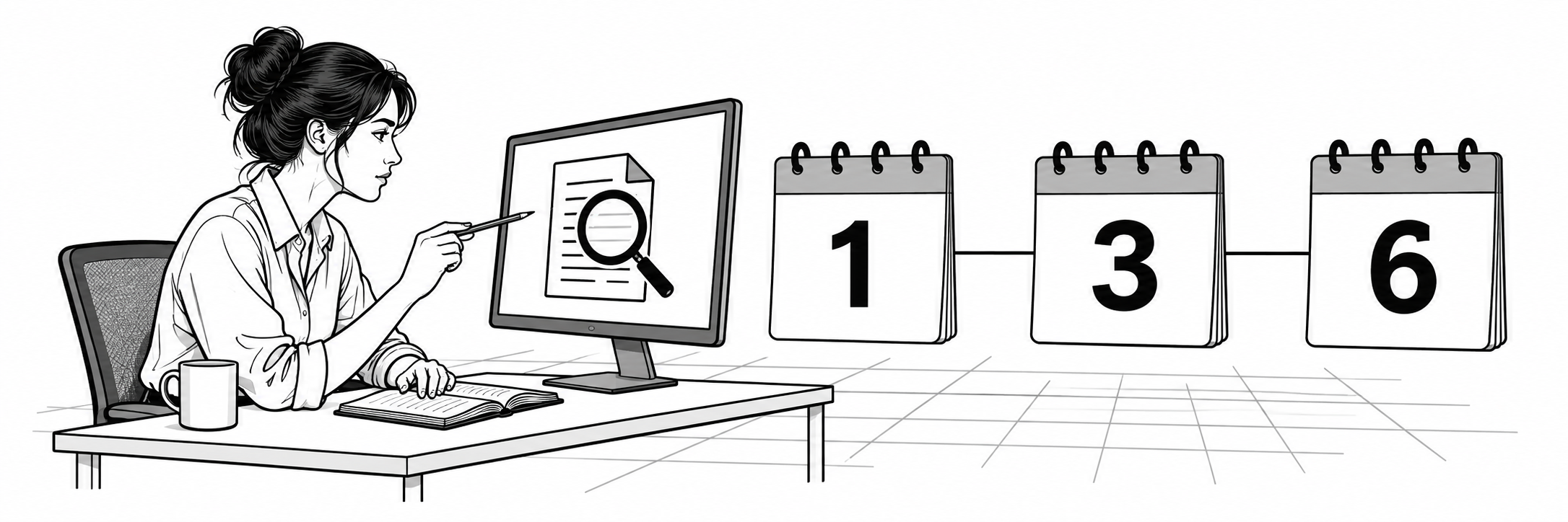
The easier design process mattered to me, but the engagement results mattered to the assignment. We continued reviewing the analytics after launch instead of treating approval of the design as completion of the evaluation.
The case study I wrote records more than six pages per visit in the first month, settling at 2.4 around the third month and holding through six months. The initial spike and the later pattern were different, which is why following the numbers over time mattered. The first month alone would have given an incomplete picture.
We changed the content, its organization, and its presentation together. I consider the engagement results in relation to that combined effort; they don't tell us how much improvement came from any one change.
For me, this was the first project in a while where I felt we had provided value closer to what the client was paying. That judgment came from seeing the work address a defined problem and then watching the site perform over time. It also changed what I wanted from the design process: more understanding before execution, and a way to assess the result afterward.
Giving the redesign a clear purpose
When I consider a redesign now, I want the team to be able to explain what behavior needs to improve, what we have learned about the problem, and how the proposed changes respond to it. That explanation should be clear enough to guide the content and layout as well as the visual design.
A productive design review is one benefit of doing that work. The larger benefit is having a redesign whose purpose can be followed from the original problem through the decisions, the finished site, and the results we return to examine.
