
Case study
U.S. Bank: Improving engagement through content and structure
Research, content, and structure decisions behind a corporate payment solutions website redesign.
U.S. Bank's Corporate Payment Solutions site had been redesigned annually, but the latest creative refresh had not increased engagement. I led the strategy, research, and information architecture for a redesign that connected the site's content more effectively and gave visitors useful paths to keep exploring. Following launch, pages per visit settled at 2.4 around the third month and held through six months of monitoring. U.S. Bank subsequently brought the approach in-house.
| Engagement | Scope |
|---|---|
| Client | U.S. Bank Corporate Payment Solutions, through an advertising agency |
| My responsibility | Strategy, UX research, information architecture, wireframes, and visual design |
| Collaboration | A copywriter contributed content expertise to the review and restructuring work |
| Delivery | A redesigned site with revised content, consistent terminology, and related-content connections |
Process at a glance
- Research: Interviewed the client and end users, and reviewed analytics and existing content to understand the engagement problem.
- Content and structure: Worked with a copywriter on consistent terminology, categories, and revised content, with related articles connected through the layout.
- Design: Developed wireframes before visual design so the goals, content relationships, and page structure could guide the presentation.
- Evaluate: The site went through user testing before launch, followed by six months of analytics monitoring to assess the combined changes.
The client wanted visitors to explore more of the site and wanted to increase traffic. Although relevant content was being added, people rarely viewed more than one page. The engagement began by examining why that information was not encouraging further exploration.
This was the agency's first UX project. I had been advocating for experience design and took responsibility for the strategy, research, and architecture. I brought a copywriter into the project because we needed content expertise alongside design. That collaboration allowed us to address how the material was written as well as how people found it.
We interviewed the client and end users while reviewing the site's analytics and existing content. Two findings shaped the redesign. Similar material used inconsistent terminology, which made it difficult to establish a coherent content structure. Visitors also had limited access to other relevant material after finishing an article.
The work therefore needed to address content strategy and information architecture together. A useful next destination depended on both a meaningful relationship between articles and a layout that made that relationship visible.
Keyword analysis informed a taxonomy: a consistent set of terms and categories for organizing the material. We used that structure to guide article revisions, and added images and subheads to make the content easier to scan. The content work gave the redesign a more consistent foundation to build on.
For the page structure, we reviewed design patterns that could expose more of the existing content library. The implemented design used a three-column layout to present related material through categories and tags. This gave visitors additional routes into information connected to what they were already reading.
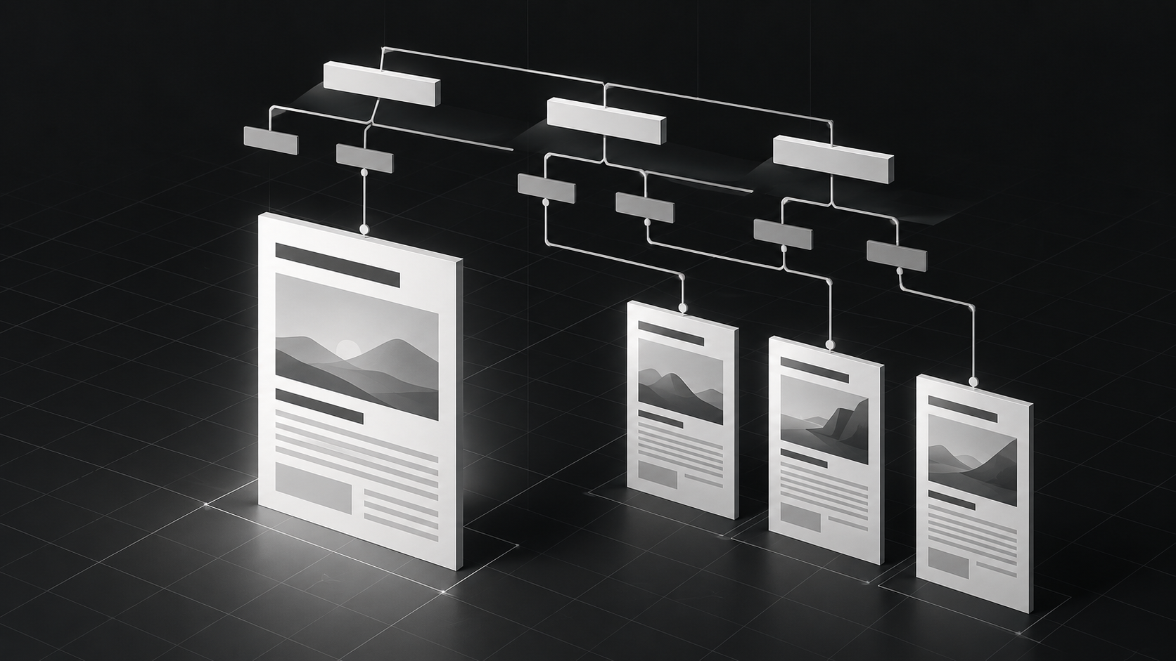
I developed wireframes before moving into visual design. Establishing the goals, content relationships, and layout first meant that many of the structural decisions were already made when I began the visual work. The design came together more easily, and I remember very few revisions. The clearer direction helped me focus on the presentation while keeping the underlying purpose intact.
The redesigned site was built and launched. The original case account records positive user testing before launch, followed by six months of analytics monitoring. That monitoring showed a substantial initial increase in pages viewed, followed by a lower, sustained level of engagement.
| Observation period | Results recorded in the original case study |
|---|---|
| First month | More than six pages per visit; bounce rate below 20% |
| Around month three | Pages per visit settled at 2.4; organic-search improvement was also reported |
| Six months | The results remained steady through the monitoring period |
The early pattern included a decrease in visitor numbers even while bounce rate remained low. By around the third month, the case records improved acquisition through organic search. Following the site over several months gave us a fuller picture than the initial launch spike alone.
These observations reflect the combined content, structure, and design changes. The retained case does not provide an exact prelaunch baseline for calculating a percentage increase or a numerical measure of the organic-search improvement.
U.S. Bank adopted the approach internally and ended the recurring annual redesign arrangement. The engagement delivered a working site and a way of organizing its content that the client chose to continue using.
My contribution was to connect the engagement question to research, turn the findings into a content and architecture direction with the copywriter, and carry that direction through wireframes and visual design. The implemented site and subsequent monitoring gave us a concrete result to assess, beyond approval of a new visual treatment.